Frudex Dry Fruits.
Branding, Website & Marketing. Brand identity, packaging, website and ongoing digital marketing for a Kerala dry fruits company — from the palm-tree logo and product labels to a premium website and social media campaigns.
- Graphic Design & Branding
- Web Development
- UI/UX Design
- Digital Marketing
- Client
- Frudex Dry Fruits
- Location
- Koduvally, Kerala
- Services
- Graphic Design & Branding, Web Development, UI/UX Design, Digital Marketing
- Year
- 2025
The Challenge
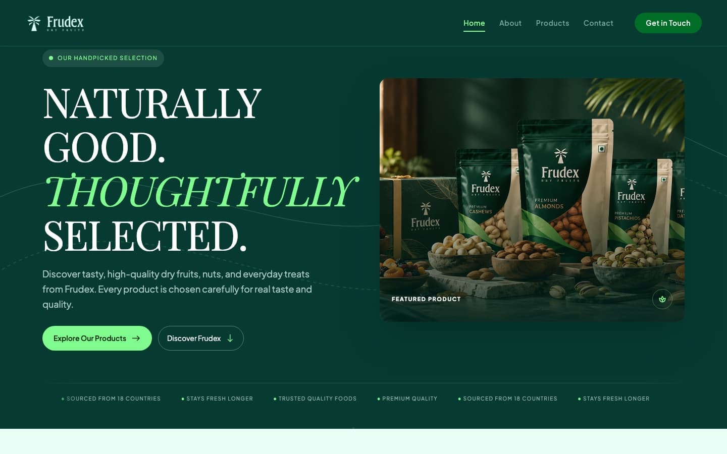
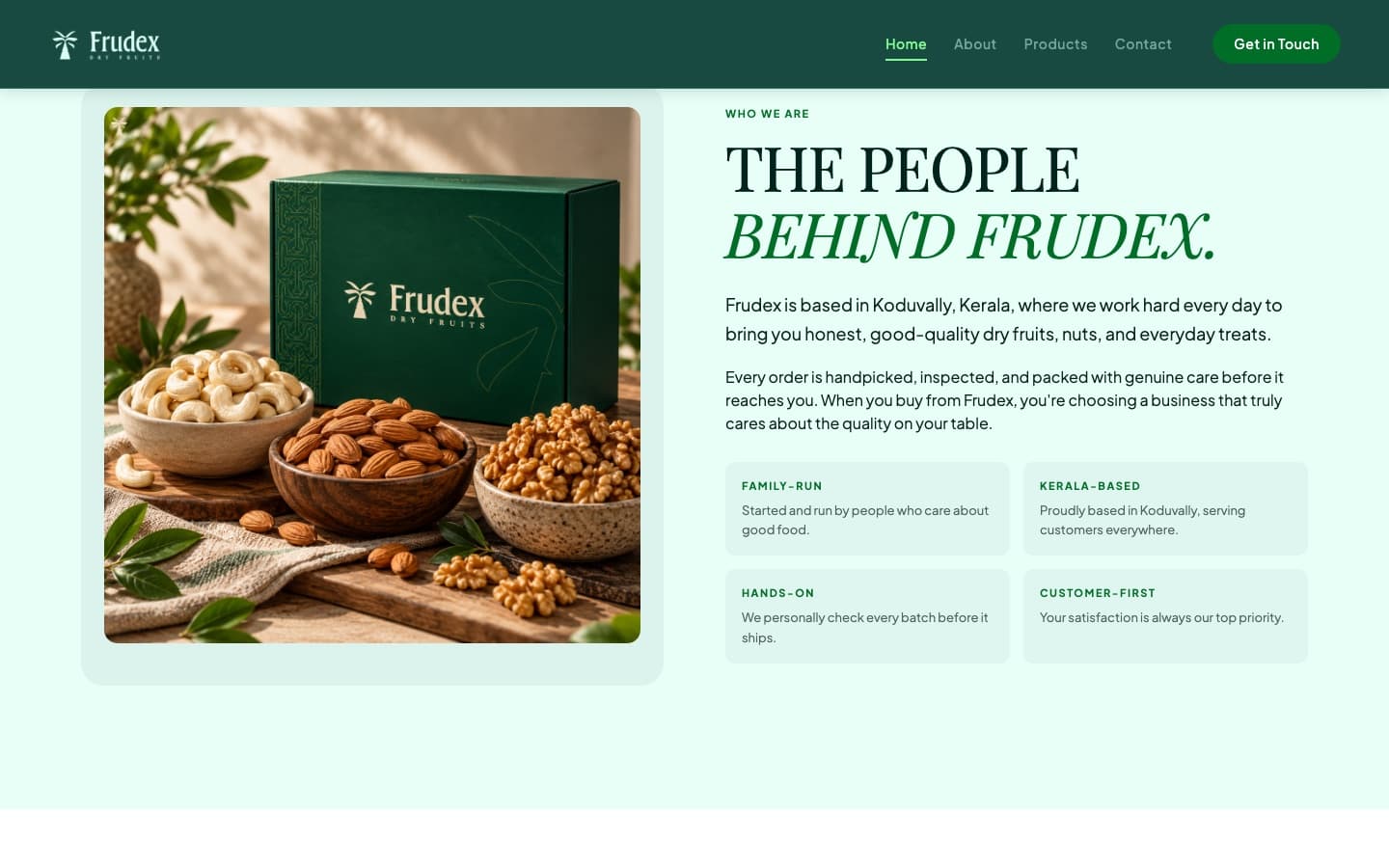
Frudex is a family-run dry fruits and FMCG business from Koduvally, Kerala, sourcing dates, nuts and everyday treats from 18 countries. Their products look and taste premium — but the business had no brand identity or website to match.
They needed a recognisable brand from scratch, and a website that could present a wide catalogue clearly, tell the story of how every batch is handpicked and checked, and make it easy for customers and trade buyers to get in touch.
The Solution
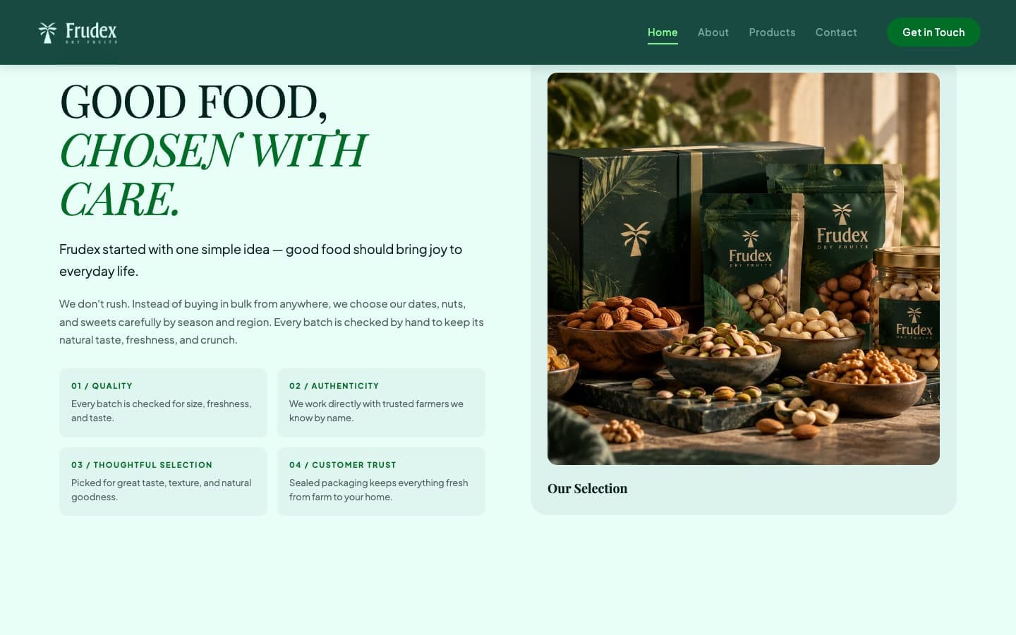
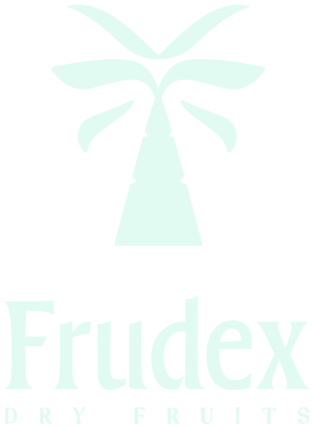
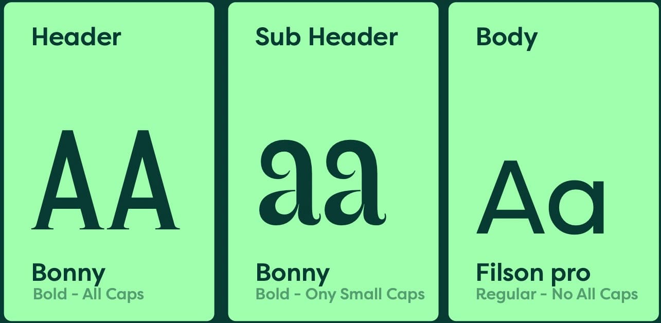
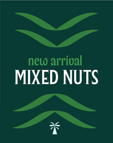
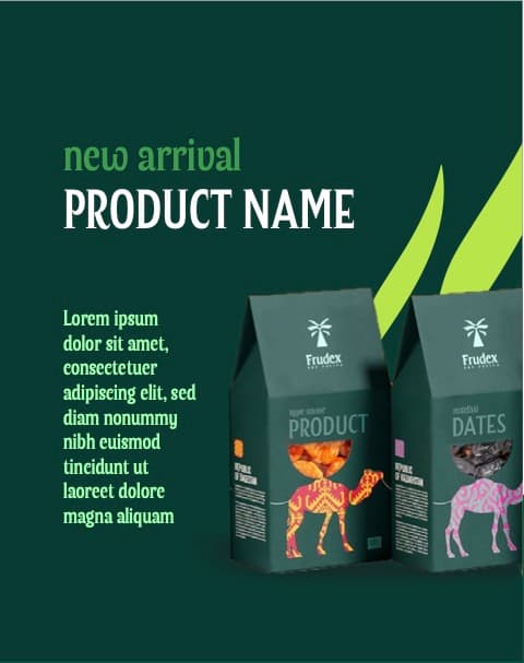
We started with the brand. The logo pairs a hand-crafted palm tree — a nod to dates and natural sourcing — with a distinctive Frudex wordmark and a “Dry Fruits” descriptor, in horizontal and stacked versions. A deep green palette, Bonny and Filson Pro typography and a wave pattern drawn from the palm's leaves complete a system that works across packaging, print, social and digital.
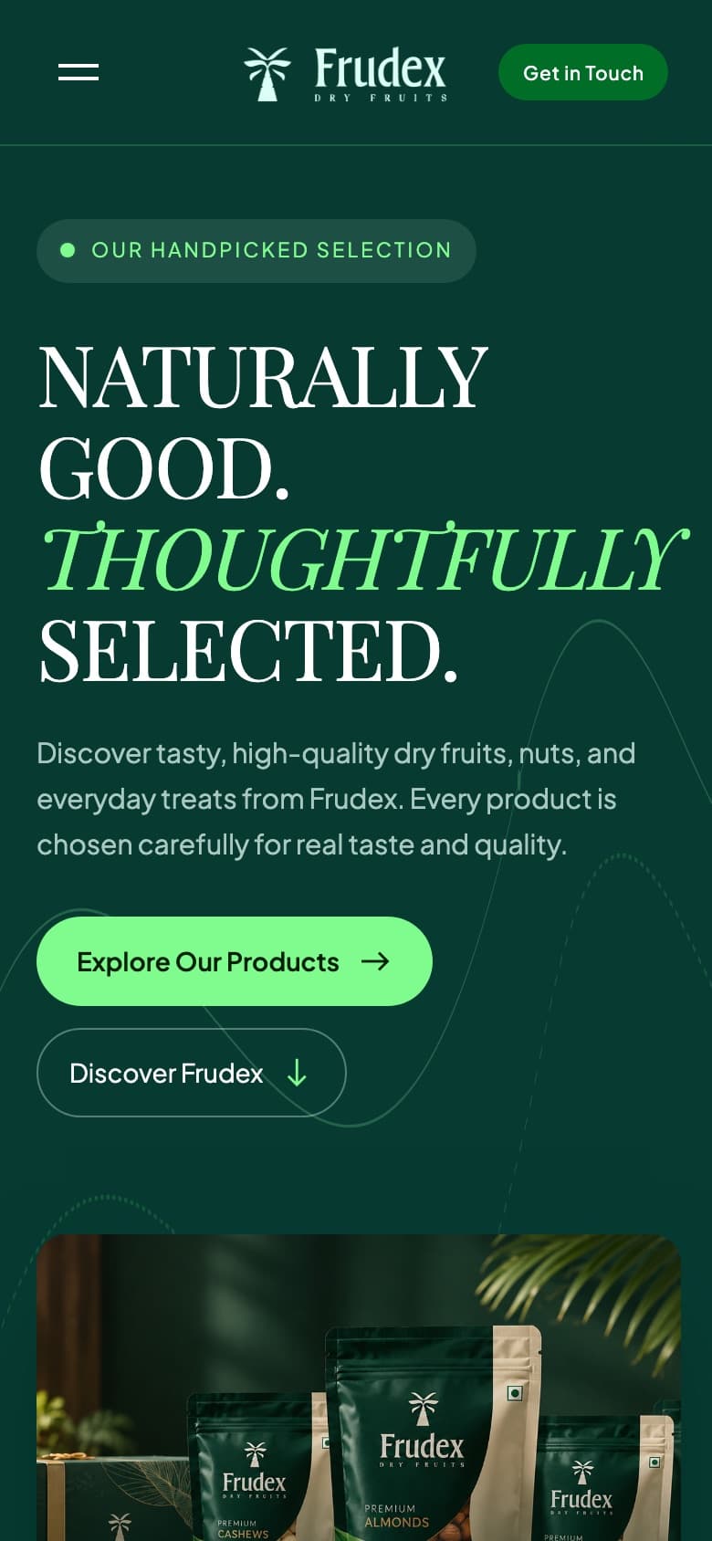
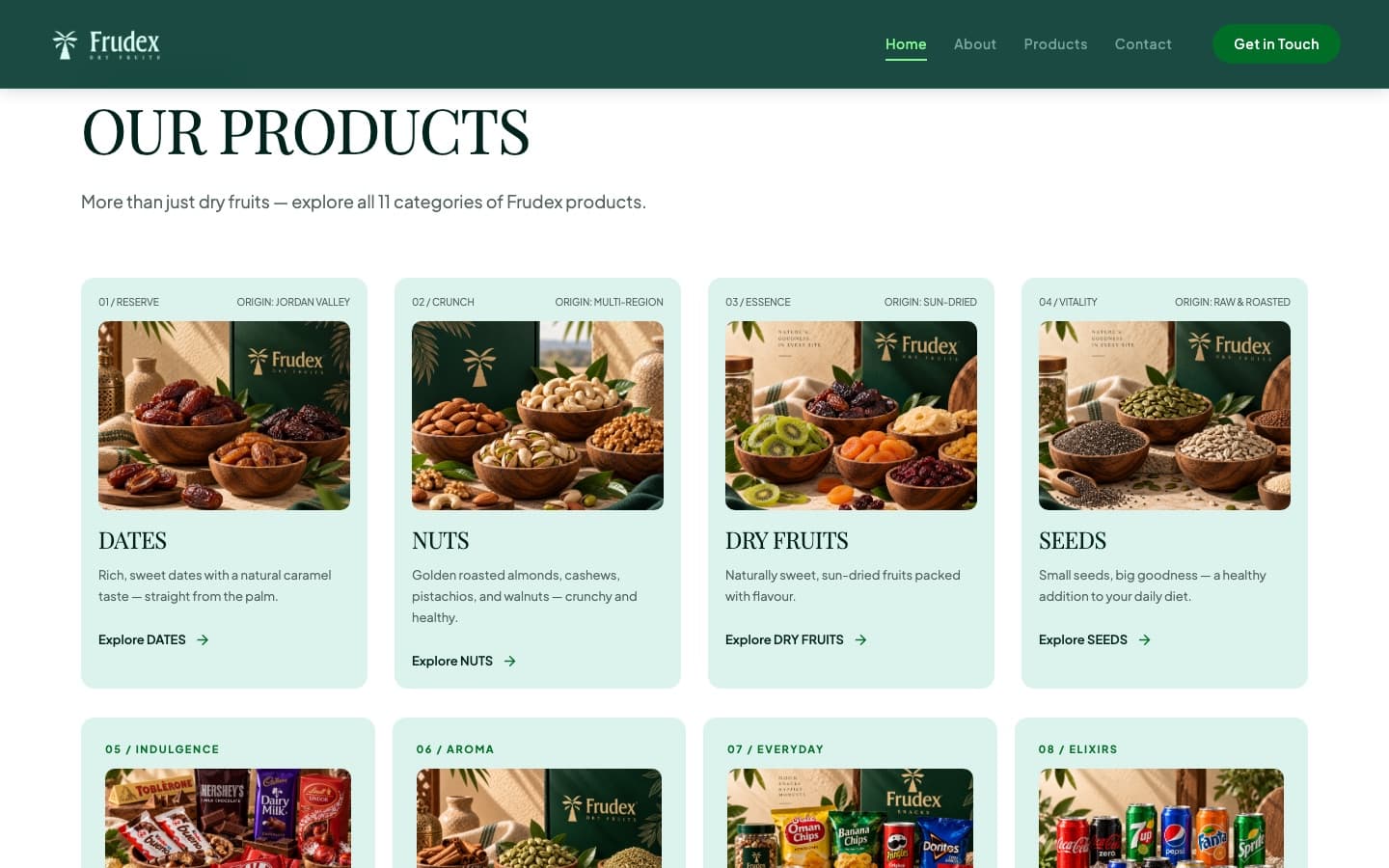
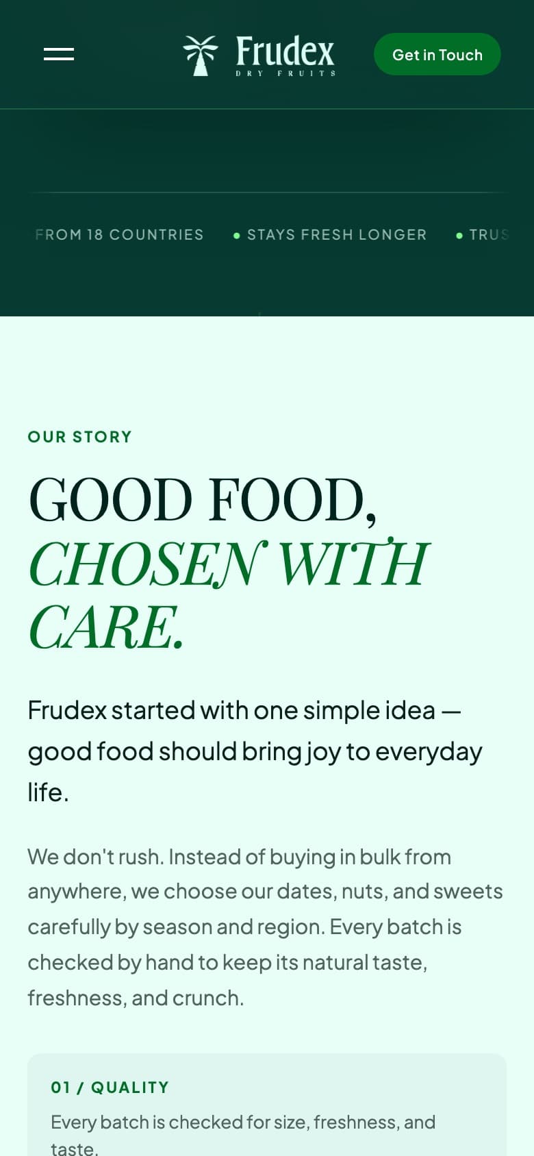
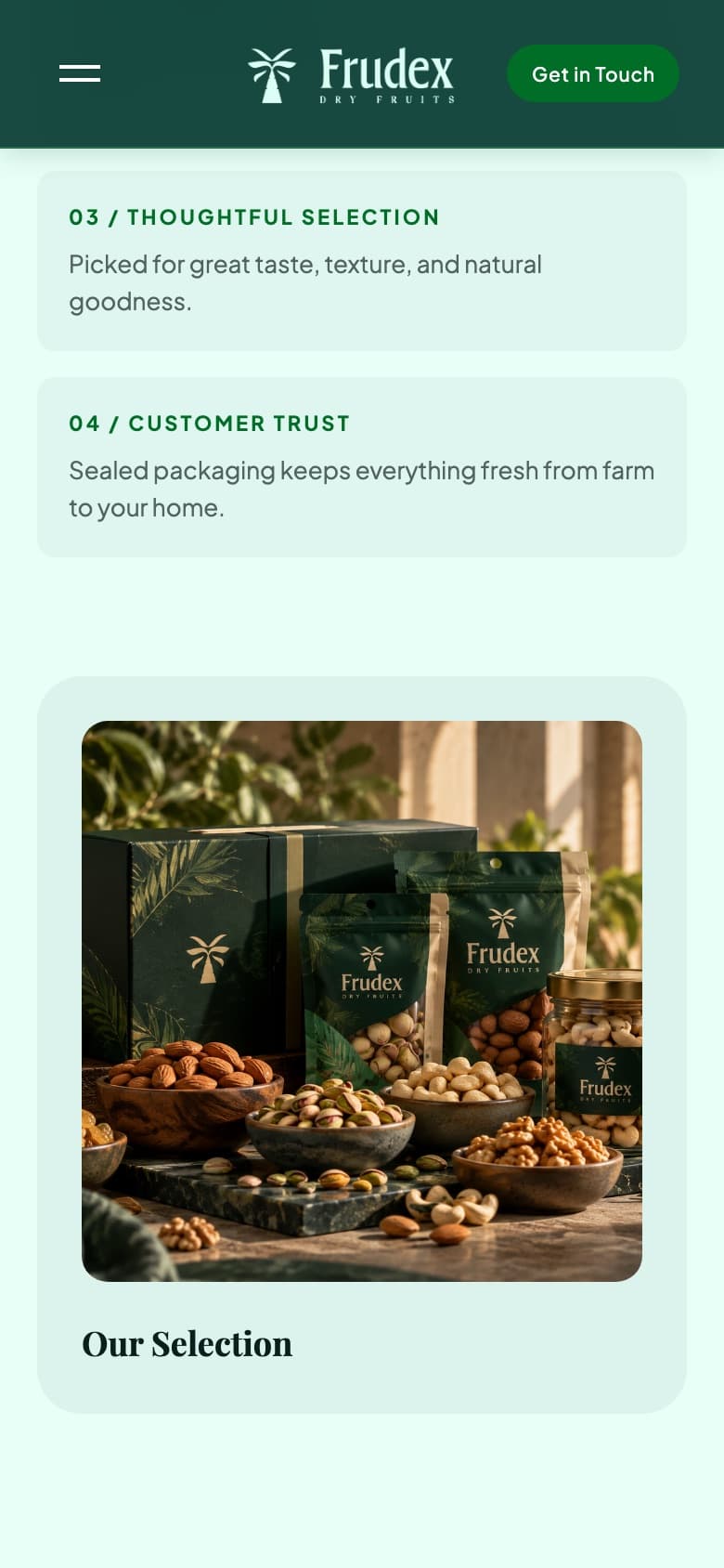
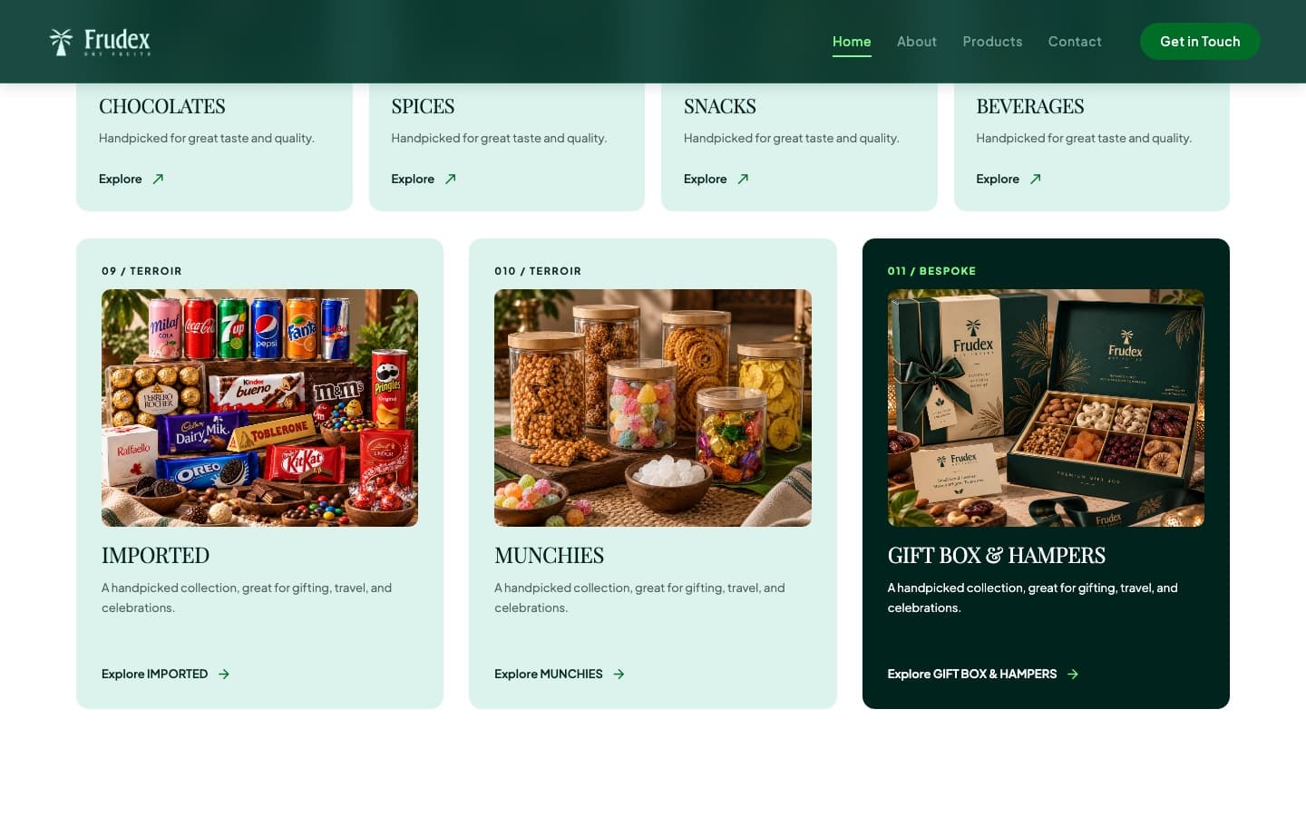
We then carried the identity into a bold, editorial website — large serif headlines, rich product photography and generous space. The catalogue is organised into 11 clear categories, from dates, nuts and dry fruits to gift boxes and hampers, and a prominent “Get in Touch” path turns interest into enquiries on desktop and mobile.
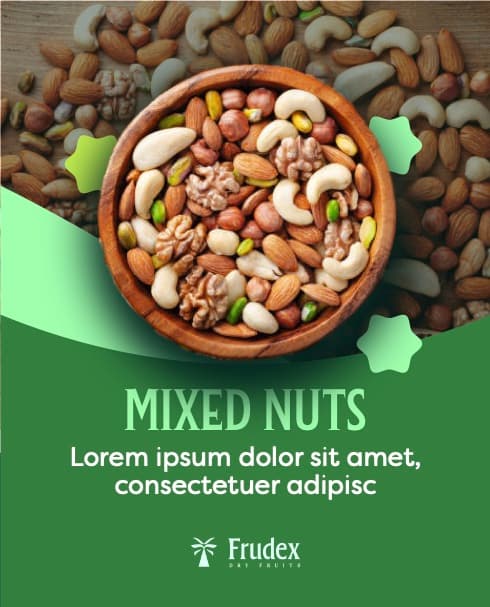
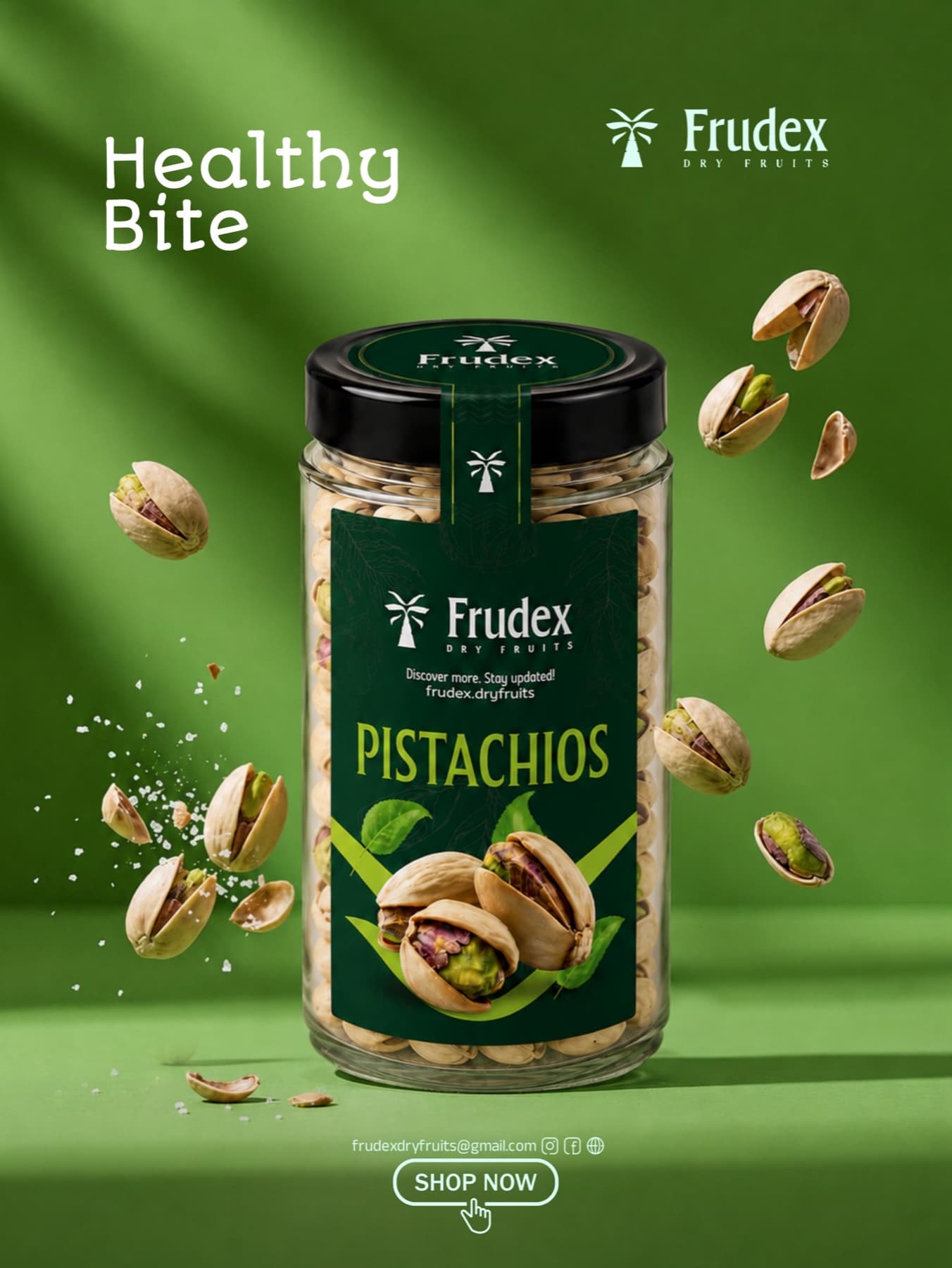
And the work continues: we now run Frudex's digital marketing — social media content and campaigns, including product creatives like the “Healthy Bite” pistachio launch — so the brand keeps growing online.
The identity.
Logo, palette, typography and pattern — designed as one system for packaging, print, social and web.



- AuthenticityTrue to its roots and product quality — nothing artificial or over-styled.
- Value AdditionEvery design choice adds clarity, usability or emotional connection.
- Brand RecognitionA distinct, consistent system that's instantly identifiable everywhere.

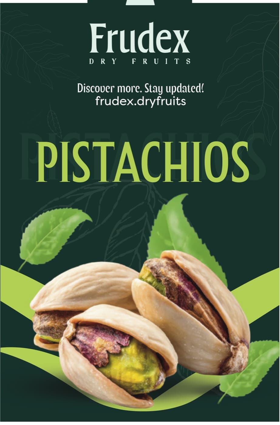
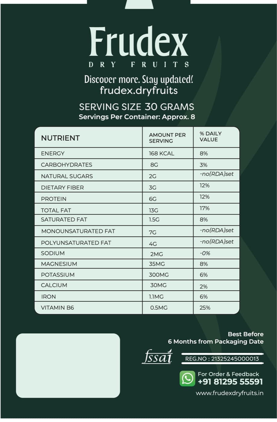
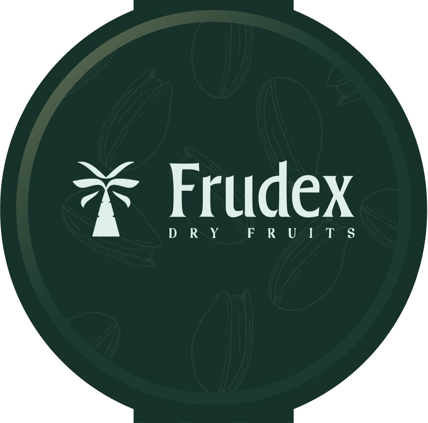
Pistachio label design.
A wrap-around label for Frudex's pistachio jar — a bold front panel with product photography, a branded lid seal, and a back panel with full nutrition facts, FSSAI details and WhatsApp ordering.

Bitzart gave Frudex a complete identity — the logo, our packaging and a website that finally feels as premium as our products. And they’re still with us, running our social media and helping the brand grow.