Iris Management Services.
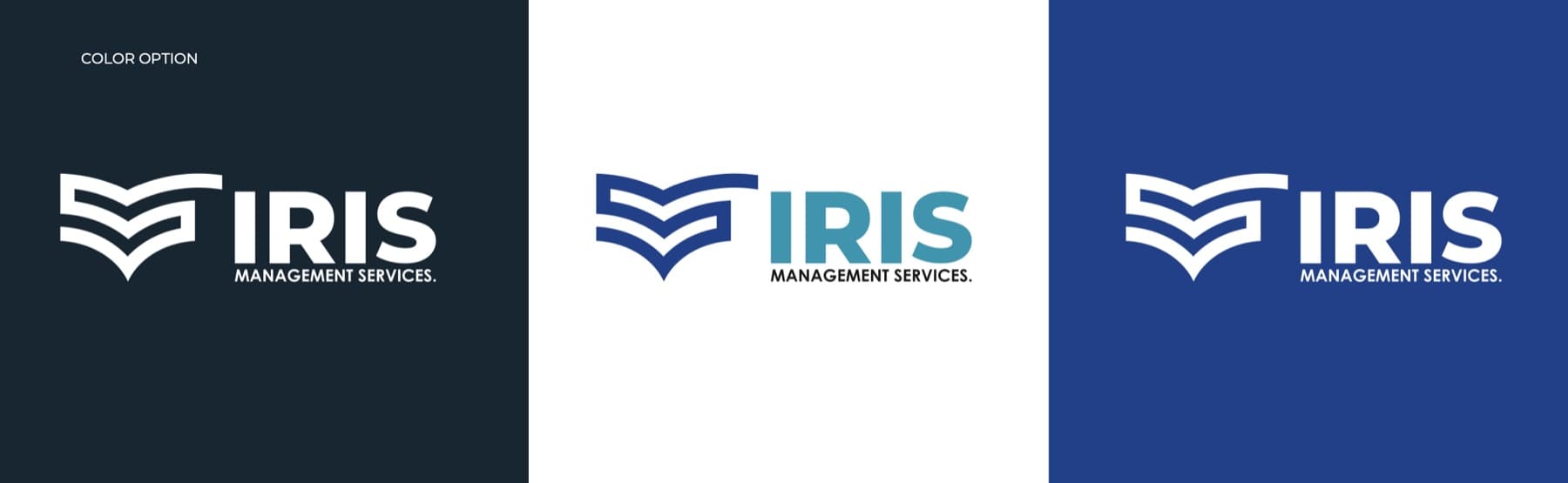
Brand Identity. Logo and brand identity for a management services company — a mark combining an open book, the letter S and a tick mark, with a blue and teal palette and app icons.
- Graphic Design & Branding
- Client
- Iris Management Services
- Industry
- Professional Services
- Services
- Graphic Design & Branding
- Year
- 2026
The Challenge
Iris Management Services needed a brand identity that would earn trust from the first glance — a professional services business where credibility, knowledge and reliability are everything.
The logo had to feel confident and modern, stay legible at every size from an app icon to a signboard, and work on both light and dark backgrounds.
The Solution
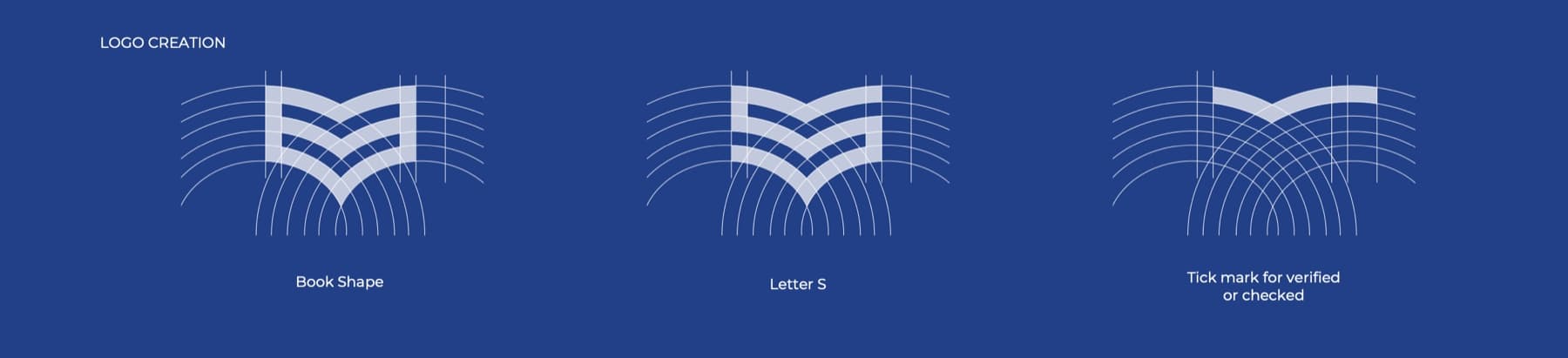
We designed a mark that carries three ideas at once: an open book for knowledge and expertise, a letter “S” for Services, and a tick mark for work that's verified and checked. Built on a precise grid of arcs, it pairs with a bold “IRIS” wordmark and a clean “Management Services.” descriptor.
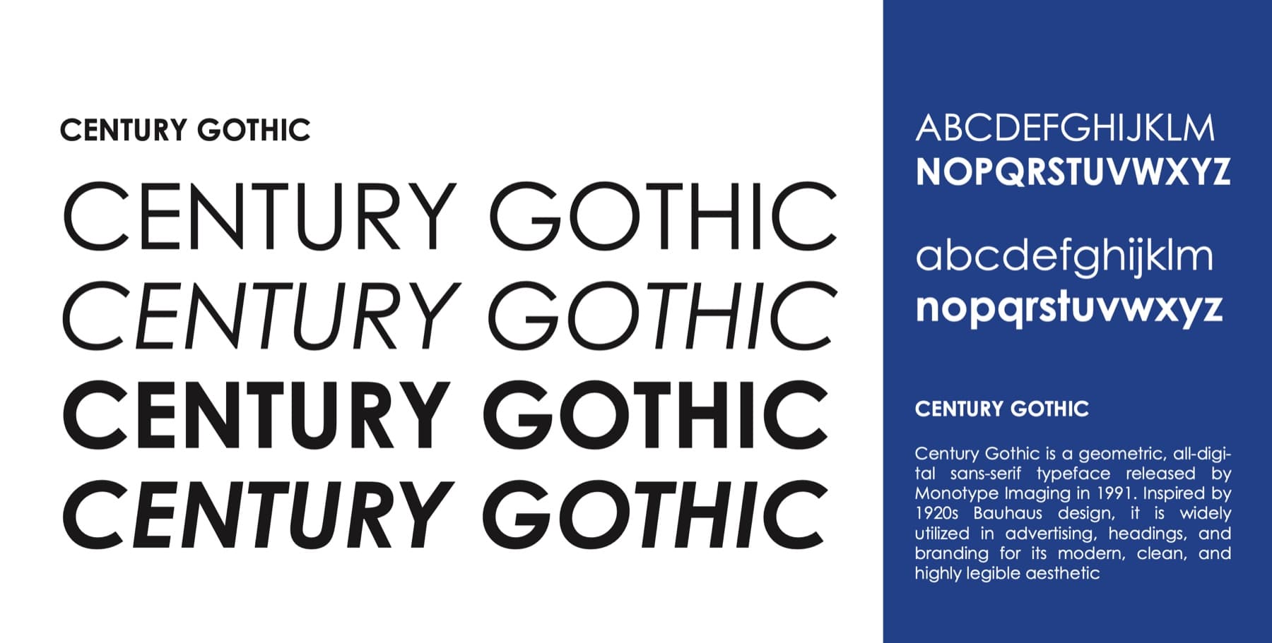
A palette of deep blue, teal and indigo gives the brand a calm, dependable tone, and Century Gothic — a geometric, Bauhaus-inspired typeface — keeps every application modern and highly legible. The system comes with colour, white and dark logo versions and a set of app icons.
The identity.
Logo, palette, typography and app icons — a trustworthy identity for a professional services business.
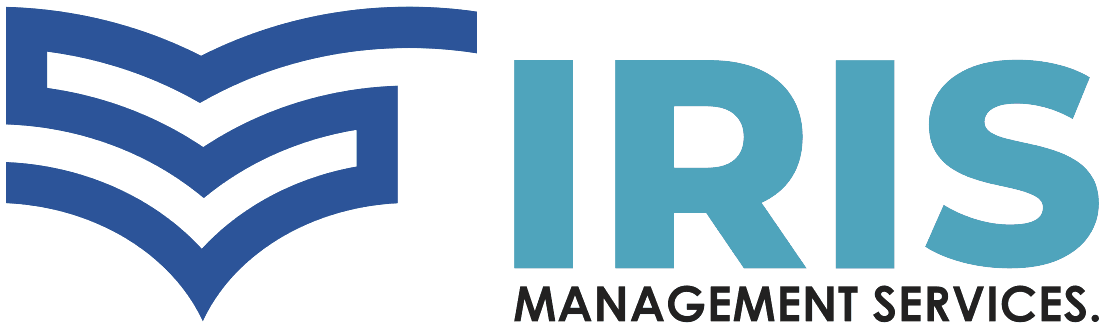


- Book shapeAn open book for knowledge, expertise and guidance.
- Letter SThe strokes form an “S” for Services.
- Tick markA check for work that's verified, reliable and done right.